

As a logo dad hat supplier, I've seen firsthand how the right logo color can transform a simple dad hat into a head - turning accessory. Dad hats are super popular these days, and a well - chosen logo color can make your brand stand out on them. So, let's dive into what colors of logos look best on dad hats.
Classic and Timeless Colors
Black Logos
Black is a no - brainer when it comes to logo colors on dad hats. It's a super versatile color that works well on almost any hat color. Whether it's a white, light gray, or even a pastel - colored dad hat, a black logo pops. For instance, a black logo on a white Cotton Baseball Caps gives a clean and professional look. It's like a little bit of sophistication on your head. It's also great for brands that want to convey a sense of elegance or authority. Think of high - end fashion brands or serious business - related companies. The contrast between the black logo and the light - colored hat makes it easy to read from a distance, which is a huge plus if you're using the hat for promotional purposes.
White Logos
On the flip side, white logos are also a classic choice. They look amazing on dark - colored dad hats. A white logo on a black, navy, or forest - green hat creates a sharp and eye - catching contrast. It's perfect for summer events or for brands that have a more fresh and modern feel. For example, a beach - themed brand could use a white logo on a navy Retro Dad Cap to give a nautical and summery vibe. White is also a great color for visibility in low - light conditions, so if you're giving out hats at night events, a white logo will make sure your brand is seen.
Bold and Vibrant Colors
Red Logos
Red is a color that grabs attention. It's associated with energy, passion, and excitement. A red logo on a neutral - colored hat, like beige or light brown, can really make a statement. It's a great choice for sports teams or brands that are all about high - energy activities. For example, a fitness brand could use a red logo on a light - colored Low Profile Dad Cap to show off their dynamic and active nature. Red also has a psychological impact on people, often making them feel more alert and engaged, which is exactly what you want if you're trying to promote your brand.
Yellow Logos
Yellow is a bright and cheerful color. It's like a ray of sunshine on a dad hat. A yellow logo on a dark blue or purple hat creates a warm and inviting look. It's ideal for brands that focus on happiness, creativity, or family - friendly products. Picture a children's toy brand with a yellow logo on a purple hat. It gives off a fun and playful vibe that kids and parents alike will love. Yellow is also very visible from afar, making it a smart choice for outdoor events or promotional merchandise.
Soft and Subtle Colors
Pastel Logos
Pastel colors are having a moment right now, and they're a great option for logos on dad hats. Soft pink, mint green, or lavender logos can give a hat a trendy and feminine touch. They work well on white or light - colored hats and are perfect for brands in the beauty, fashion, or wellness industries. For example, a beauty brand could use a pastel pink logo on a white cotton dad hat to give a soft and luxurious feel. Pastel colors are also very popular among younger demographics, so if your target audience is millennials or Gen Z, this could be a great choice.
Consider the Hat's Material and Finish
The material of the dad hat can also affect how the logo color looks. For example, on a cotton hat, colors tend to look more muted and natural. So, if you're using a bold color like red or yellow, it might be a bit less intense compared to a hat with a shiny or synthetic finish. On the other hand, a shiny finish can make the logo colors look more vibrant and eye - catching. If your hat has a distressed or vintage look, like a Retro Dad Cap, earthy or faded logo colors can add to the overall aesthetic.
Brand Identity and Target Audience
Your brand identity should be the guiding star when choosing a logo color for dad hats. If your brand is all about being eco - friendly and sustainable, earthy tones like green, brown, or beige for the logo would make a lot of sense. If your brand is edgy and modern, you might want to go for bold and bright colors.
You also need to think about your target audience. If you're targeting a younger crowd, they might be more into trendy and vibrant colors. Older audiences might prefer more classic and subdued colors. For instance, a brand targeting retirees might choose a black or navy logo on a simple white hat, while a brand focused on teenagers could use a neon - colored logo on a trendy hat.

Testing and Sampling
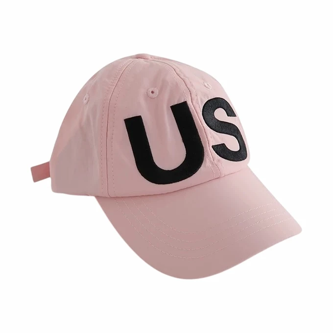
Before you go all in and order a large batch of dad hats with your logo, it's a good idea to do some testing. Order a few samples with different logo colors on different hat colors. This way, you can see how the colors look in real life and get feedback from your team, customers, or a focus group. It might take a bit of time and money upfront, but it can save you from making a big mistake in the long run.
In conclusion, there's no one - size - fits - all answer to what colors of logos look best on dad hats. It depends on a variety of factors, including the hat color, material, your brand identity, and your target audience. But with a bit of thought and experimentation, you can find the perfect logo color combination that will make your dad hats a hit.
If you're interested in ordering logo dad hats for your brand, I'd love to chat with you. Whether you have a specific logo color in mind or need some advice on what colors would work best, I'm here to help. Get in touch with me to start the procurement process and take your brand promotion to the next level.
References:
- Color Psychology Studies
- Fashion and Marketing Research on Logo Design